Search Destination Hierarchy Re-architecture
I led the re-architecture of the TUI destination hierarchy, replacing fragmented regional structures with a unified, scalable system for global consistency and improved search.
Overview
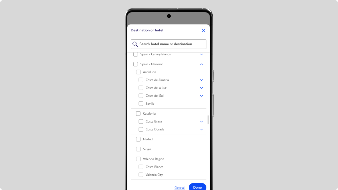
I led the redesign of our destination data structure (Geohierarchy) to align with global business requirements while maintaining a seamless search experience for the traveler.
Problem
The current structure of search destination hierarchies across European markets is inconsistent, leading to different options for customers searching across different markets, and making the maintenance of these various hierarchies time-consuming. This presents a challenge in balancing the desire to show users all levels for countries available in their market with the need to show ‘just enough’ detail.
Discovery
To understand the current state of the search destination hierarchy, including the data variety, level depth, and usage, I conducted an investigation focusing on the following areas:
- User Interface: I examined the search panels across various TUI market sites.
- Data Analysis: I reviewed the actual data sets to compare the types and formats used across different markets.
- User Behaviour: I analysed analytics data to identify what users are actively searching for and viewing.
- Competitive Landscape: I benchmarked our approach against similar brands in several European markets to see how many hierarchy levels they display.
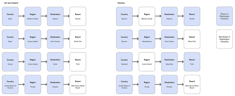
While the user interface for displaying Geohierarchy levels is generally consistent across our markets, the scope and complexity of the underlying data vary significantly. This difference is partly due to the specific holiday options available from each market. The analytics strongly supported feedback from market stakeholders: users primarily search for resorts in Mediterranean countries.
Design
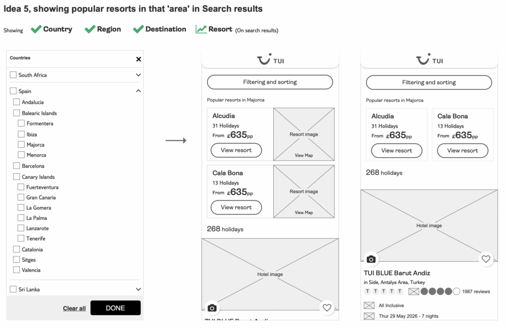
With this knowledge, I began brainstorming ideas on how I could display the updated global geo-hierarchy without showing every single level as a massively long list, which would be overwhelming for users. Some of the ideas I looked into include:
- Showing the region as part of the country
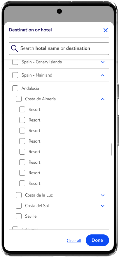
- Showing every level as accordions
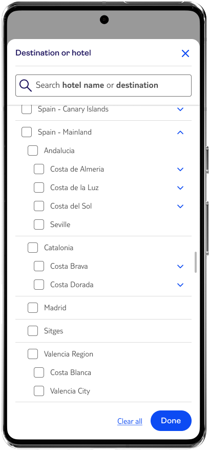
- Splitting some of the relevant countries into mainland/island groupings, e.g., Spain and Greece
- Showing popular resorts in that destination
- Splitting the countries up into groups, e.g., Europe, Caribbean, Far East
Developer Documentation
Once I had a decision on the direction, I thoroughly documented the logic around what these decisions would look like using the hierarchy, so, for example, if the user selected Spain, what options would they see, how would the user get to the lower levels of the hierarchy, etc.
Accessibility
Throughout the project, I worked on the accessibility documentation, a key output for every project, to support the goal of compliance with the Web Content Accessibility Guidelines (WCAG) AA standards. This includes page landmarks, tab and reading orders, as well as defined ARIA roles and relevant announced content.
Projected Key Outcomes and Results
Currently being developed, this re-architecture of the geohierarchy has been designed to bridge the gap between complex market requirements and an intuitive user experience for a single, scalable system.
Operational Efficiency & Scalability
- Global Consistency: Designed a unified geohierarchy across all TUI markets, replacing fragmented regional structures with a single, scalable hierarchy and logic.
- Reduced Maintenance Overhead: Once fully implemented, the updated structure is projected to reduce the future effort required for teams to update or add new destinations across markets.
Improved Search & Selection UX
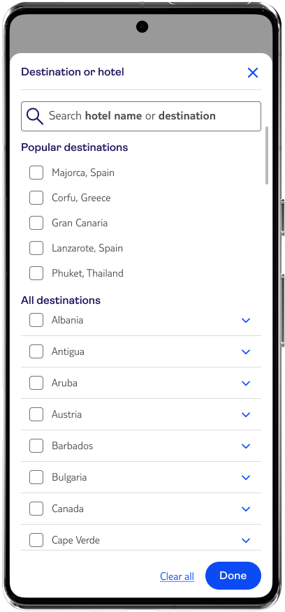
- Enhanced Destination Discovery: By introducing clearer visual cues for nested destinations, the design aims to help users “drill down” beyond the country level, encouraging more specific, high-intent searches.
- Improved Selection Clarity: Refined the feedback loop in the search panel to make current selections more explicit
- Unified Marker Experience: Created a “borderless” user experience; users will encounter the same logical structure and ease of use regardless of which regional TUI site they are visiting.
Solution
Currently in development for launch, this solution has already been adopted into the TUI Design System. By documenting the core logic for global reuse, this project now provides a scalable blueprint for search functionality across the entire TUI ecosystem.
Outcome
This project wasn’t just about creating a better interface, it was about fixing the foundation. This new structure replaces 13 fragmented systems with one clean, accessible model—slashing the engineering time needed for future updates and ensuring a consistent experience for every user, regardless of their location.